Has your development team just created an amazing software that solves major problems and improves your business? If you’re not sure how to sell your brand new software, from a front-end point of view, a landing page is exactly what you’re looking for. Creating a simple, yet powerful and effective web page isn’t as hard as it seems. Think of this blog post as your guide to creating a landing page that will sell your digital product. Grab your ticket and take your seat because we’re taking off.
Have more graphic content and less text
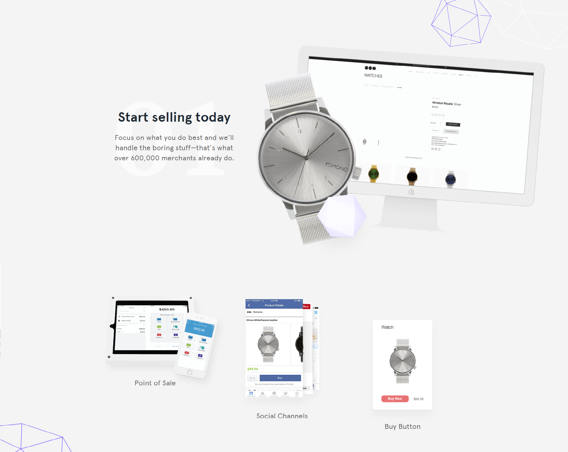
Our first stop is content and tips on presenting your software product to the audience! Your content team should make it short and clear. Forget about blocks of text and especially sorting them into those 3 common columns as you can see on Synopsys and Ziipongo web pages. Try to play with graphic elements such as icons or images and short terms. The more text you have on your page, the more likely it is for visitors not to read it. So, if you have crucial information that needs to be seen, highlight it and make it visible. The only thing to remember here is to omit description and details leaving your layout clear and neat. Visitors would still get all the information and wouldn't be bothered by irrelevant ones. Finding a graphic element that represents most of what you want to say is a decent solution but not applicable in all cases.

Forget about the classic navigation
What about the navigation? Inline-blocks on desktop devices and hamburger menu on mobile devices are indeed old-fashioned and they kill your landing page conversion rate. You probably think: “Well...it may be old-fashioned, but how am I supposed to navigate through the web page?” An alternative to classic navigation is sticky navigation which refers to simple stickers that help you with orientating on the page. Gumtree Jobs did a great job with its navigation. To spice things up, you could use Scrollify, Power steering for your scroll wheel, as the author says. Scrollify doesn’t count as navigation but rather an effect while scrolling because it sticks elements as you scroll. You can combine this effect with stickers to create an interesting alternative to classic navigation. Problem is that Scrollify could be confusing on mobile devices so the suggestion is to use it only on desktop devices. There are numerous options and you can really be creative here depending on the purpose of your web page.
See the Pen Sticky navigation and Scrollify by Ljubica (@ljubica_b) on CodePen.
No rainbows and unicorns in the testimonial section
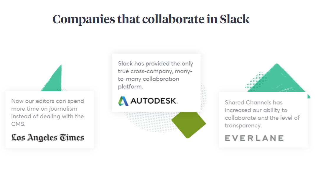
Testimonials play a huge role in web pages that sell. If you’re not sure about this term, those are small snippets of reviews from previous customers that inform future customers about what they think and how they feel about the product. You’re definitely more likely to try and/or buy a product if you see that a real person had already tried it and left his/her thoughts on it, positive, of course. So, the suggestion is to have a few testimonials of quality that will increase the chances for your software to be bought. They shouldn’t be too generic, but also shouldn’t talk rainbows and unicorns because those kinds of reviews indeed seem suspicious. A good example is just a brief description of a problem that the software is solving and how they feel about it. The best testimonial you can have is a whole company represented by its CEO, so if you could get few of those, congratulations, your testimonial section is rated 5 stars!
Make pricing packages transparent and clear
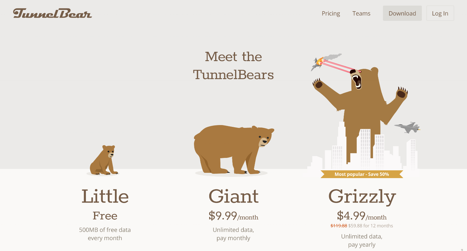
We’re slowly approaching pricing section of the web page. Are you ready to sell your product? Now that we have content, can navigate through it and have a few testimonials, we’re ready to present pricing packages to our visitors. You don’t want to lie to them about pricing, don’t you? Well as simple as it is, just be honest and make everything clear and transparent. Create 3 to 4 tables with prices and brief explanation what each package consists of. Lower prices allude fewer services and resources. In addition, the more user pays, more of these will be available to him. You should also make it possible for a user to contact you if none of the presented solutions is suitable. Feel free to create a special package if the visitor takes the time off to send you a request and is interested in what you offer but has problems with finding what he exactly needs. 
via TunnelBear
Try to amuse your visitors
While exploring your web page, visitors should be amused and you should give them reasons to stay on the page for just a little bit more. Everyone is familiar with gamification nowadays. It is applicable to everyday situations. Reward visitors’ loyalty and feel free to give them a discount if you notice they’re spending a lot of time on your page carefully scrolling through its sections. Guide them through your web page, introduce them to a chatbot, don’t let them leave too early. You can hide promo code somewhere on the page, you can make a quiz or a mini-game that pops up after some time, or you can reward a visitor and send them a pdf brochure just for leaving his or her email address. In the codepen example, you can see how to turn one of those suggestions into a code.
See the Pen Panda facts gamification by Ljubica (@ljubica_b) on CodePen.
Data security as a CTA?
Here we are, almost at the bottom of the page. Now is the right moment for the visitor to click that CTA button and buy your software product. Have the visitor’s needs been satisfied? Is he having second thoughts? You can’t do a lot here but to offer data security, money back guarantees and friendly tone. Even if the CTA button does get clicked, there are things regarding form that could make him change his mind. Avoid mistakes by following these steps: increase button size and clickable areas, use drop-down fields only if there are more than 5 options, use HTML attributes for numbers/text/password field. It is important to have fewer fields and not ask for a lot of information. After submitting, you should have a thank you page or screen or just a few nice words that will show how thankful you are. Here you can see a simple example that summarizes the stated.
See the Pen Simple CTA, form and thank you screen by Ljubica (@ljubica_b) on CodePen.
The journey has come to an end
Has this journey through simple landing page that sells helped you with vision on how to sell your software product? Write these tips down and have a chat with your designer who will know how to make your ideas happen. Have in mind everything I mentioned here: less content is actually more, try to omit common navigation links, have transparent testimonials and pricing packages, be careful with fields on subscription form (less is again more), implement gamification. Taking the above steps will definitely help you with presenting your software product in the best possible way and also help to intrigue and attract visitors. Thank you for reading and good luck with selling your software products via awesome landing pages! :)

 via Slack