
Getting user's attention and getting them to convert is not an easy job. Most of the users are just passively scrolling through web pages and leaving them without actually doing anything. But you can get them to be more actively involved by using interactive elements on your landing page, so keep reading this blog post if you want to find out how.
Since landing page is a standalone web page explicitly created for the marketing and promotion purposes, it shouldn't be just a simple static page with a call to action at the bottom. It needs to spark interest in users right away, so they don't leave immediately. According to the NN Group article, average page visit last less than one minute and users often leave within 10-20 seconds, which means that you don’t have much time to grab their attention. I often find myself in that situation - visiting a website for the very first time and if it is not what I expected, leaving within seconds unless there is something eye-catching such as fun animations or videos. So using interactive elements like these to transition between sections or to show off the key parts of your site will make users (like me) more engaged and willing to convert.
An interactive element is anything that a user can interact with. Or in other words, anything that is clickable. This doesn't mean that you should make anything and everything on your site clickable. Elements that should be interactive are the ones that help your users pay attention to the most critical aspects of your site. So here are seven interactive features that will help you improve your landing page ...
1. Animations make a page more unique and interactive
Simple and easy way to create visual interest and draw attention towards content is by adding animations. They make landing pages much more unique and interactive. Also, the whole purpose of animation is to enhance the design and fill in the gaps, so you should use this opportunity. When doing so, identify which elements to animate, which animation to use and when it is going to be triggered. Afterward, apply all that consistently to create a great experience. CSS transition and transform properties or keyframes are great to develop simple stuff like making a scroll down arrow bounce on hover or making paragraphs fade in on the scroll. Keep in mind that there are so many possibilities to explore with animations and it is easy to overextend, so be careful.
2. Don’t ignore buttons
Buttons are interactive elements that every landing page has and they are an essential part of every web page. But even with simple elements, you can create very unique and creative follow-ups. Usual challenge is that buttons might not be so obvious, easy to find or they are not indicating to users what happens after they click on them - this way users lose trust.
Having a cursor change on hover will point out that something is clickable and that way users can easily identify which elements are interactive. Having an animation to make it more noticeable or call-to-action text can help increase the clicks.
A simple example of a button is the one which reveals an additional text after the click. It helps your landing page stay clean and gives users a way to engage with your content. However, a more creative example would be the one on the Typeform site where they show different ways of their product use cases. On the right side, there are buttons, after they are clicked on, show one way of using Typeform and that part is also interactive.
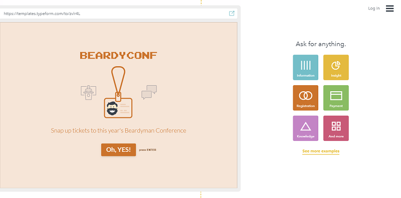
Buttons from the old version of the Typeform site
3. Forms - fewer fields, more conversions
Forms are seen as the most popular method of conversion and standard part of landing pages. But it appears that their median conversion rate is somewhere between 3-5.5%, which means that forms are not as high-converting as they could be. Common mistakes people make with forms are: too many fields, confusing instructions, asking for personal information user is not comfortable to share, etc. Besides that, users are more prone to scanning than in-depth reading, and if they take a quick look at form and feel like it requires too much effort they won't fill it out.
To get users to fill out the form, they need to be interested in your content, and then you build up their interest with interactive elements. However, once a user is at the fill-the-form point, it should be very easy to fill it out, so they don't have time to change their mind. This means only asking for the necessary information and no distractions. Also, make sure to provide appropriate labels and other instructions if needed to avoid any misunderstandings.
The GlobeKit landing page has a great example of the form. Scroll through product features or click on the button to get to the form which is simple, short and easy to fill out.
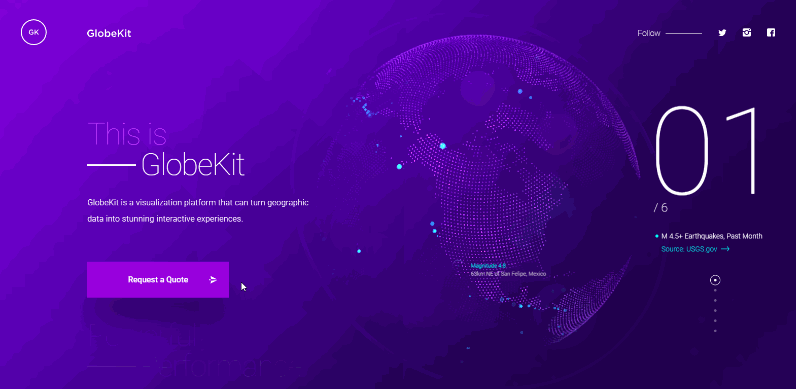
The GlobeKit’s form
4. Video sends a stronger message
The video is another common interactive element which is considered to be highly engaging. And that should not come as a surprise because people like to watch videos, they love stories, and they can relate to them. User remembers 95% of the message when it is viewed and only 10% when it is read (according to post by Monica Carvalho), which means that video often makes more sense then just necessary information and it can have a more significant impact. Having autoplay on a video is a good idea because it draws more attention that way. But it can be annoying for users who don’t want to watch the video or if something very loud starts to play - it can also drive them away from your site.
What you want to do is have autoplay on, but with audio turned off (a common practice seen on most social media platforms). That way users who want to watch it will have no problem looking for the unmute button, while ones who don’t want to watch it can easily skip it. Another option is a few videos with a possibility to choose before playing them. This way user can engage and get content based on their interest which will make them stay on your page.
Amazing video examples can be found on the Benchmark site. They have five different banners that serve as navigation and hovering over each plays a different video which makes you interested in exploring more.
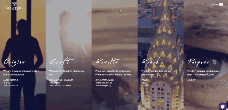
The video examples on the Benchmark site
5. Social media sharing buttons remind users to share the content
Lately, there have been more and more blog posts about people removing social media sharing buttons from their sites, claiming that users don't engage with them and that if users love your content they are gonna share it anyway. But even those say that having social media sharing buttons can remind users to share the content - so why remove them? In my opinion, they are still useful, because there are still plenty of users who would rather be just one click away from sharing something then having to copy URL and then going to their social media profiles to paste it and share it.
So yeah, you should still encourage users to find and share your product, business or idea on social media. And by doing so, these sharing buttons can bring you more users who will be easier to convert. But you can go beyond that and include share icons, latest Instagram photos, Tweets, etc., or even make parts of text shareable when highlighted. Also adding call-to-action text next to social media actions can help increase engagement.
Cheetos web is a great example of good practice. At the very top, they have the bar with Tweets from other people. Their main content includes lots of their Tweets, which when clicked on, also give options to share while in the footer, they got links to their social media accounts.
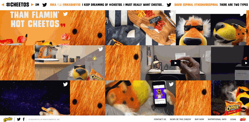
Social media options on the Cheetos site
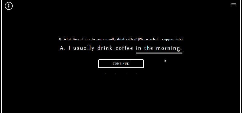
6. Quizzes, surveys, and polls provide valuable data about users
Interactive elements like quizzes, surveys and polls don't work for every site, but if they fit with your content, they can be really interesting for users - especially quizzes and polls which are super popular. Two reasons why people like quizzes are that we like to talk about ourselves and we like to learn about ourselves, which comes from a study by Harvard University researchers that showed how we are psychologically addicted to talking about ourselves. Quizzes are also specific because they can prolong users attention span to longer than 2 minutes and given that user already spent the time to take the quiz, there is a greater chance that they will leave the email. For you, quizzes are helpful with selling your product or getting opinions from users about a specific thing. They work similarly to forms in a way that once the user starts to engage with them, you shouldn't distract them and interrupt the flow with additional content. Instead, keep interface clean and minimalist so they can focus on what they are doing.
The Two Chimp Coffee has an amazing quiz example. It takes only a few questions to find out which of their coffee is best for you, and of course, you will be more likely to buy it afterward because the solution is personalized to your needs and they are giving you a value in return.
Surveys can be a quick and relatively easy way to get data about your users. But they tend to be lengthy and boring and research found that respondents tend to spend less time on each question the longer the survey is. Also if a survey is longer than 7-8 minutes, completion rates drop by up to 20%.
To have a higher response rate with surveys, you should try to have more closed than open questions so users have to type less. That makes a survey easier to complete and also easier to analyze, but if a survey needs to be lengthy, it is best to separate it into steps or just one question at a time.
7. Interactive Infographics can be a great communication tool
Infographics are a fantastic tool to show an idea or how something works in just a few seconds. They also present statistics in a much more appealing way than just looking at plain numbers. So if your site needs to showcase some analytics or communicate some lengthy topic, consider using infographics. Especially interactive ones, cause it will definitely be more interesting for users to explore and interact with them. They’re easy to understand and visually compelling, which will leave a great impression on a user.
A great example is one at Serio Verify site. They use interactive infographics to show how their platform works, its’ features and benefits.
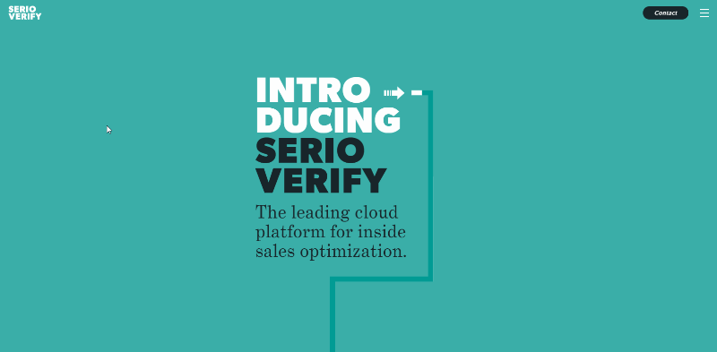
Interactive infographics on the Serio Verify site
These were some interactive elements that can help your landing page deal with user's short attention span and help to get them interested and more engaged with your content. Even the most basic interactive elements, like buttons and videos, can be made more fun and bring more engagement and conversions. Before you go crazy on implementing all these elements, try to decide which ones best suit your website and business goals. Then try to make them eye-catching and easy to understand so users know instantly what is clickable and what isn't. Last but not least, keep in mind best practices for each in order to get the most out of them.