If you go to Google Images and type “web design trends 2022”, I’m sure you’ll find some smooth, plastic, human-like, pastel-colored figures and objects. If you look at the user interface (UI) surrounding it, you’ll see soft, clay-like buttons, and rounded fonts.
The trend we are talking about here is called claymorphism, and it is a refreshing update to web design trends. Let’s get into the story about how claymorphism became a trend and how to make your claymorphic UI in Figma and with the good ol’ CSS.
Avatarz.design
What is claymorphism?
To understand claymorphism, we need to rewind to previous design trends. In the late 2000s, the first iPhones had a unique UI. The ‘smartphone’ term itself was revised, as it didn’t represent business phones with physical buttons anymore. It started to represent a sleek device with an intuitive touchscreen.
Turning everyday elements digital
However, to get more people onto these new devices, Apple had to make sure that people would get used to using the new iPhone design with ease. They designed apps to represent real-life gadgets and tools that the new smartphone replaces.
For example, the calculator app looked like a real-life calculator. The notes app looked like a paper notebook. In fact, the original icon for the YouTube app didn’t even feature the YouTube logo! Instead, the icon for YouTube looked like an old-fashioned TV. The same thing happened with Instagram’s previous logo, which was designed to look like a Polaroid camera. It’s a way to help people perceive the app as the camera app. In other words, showing rather than telling.
This trend where the app’s UI imitates likeness is called skeuomorphism. By applying it through iOS, Apple made its devices easy to use (and understand) for people who have never touched a touchscreen before. Besides, a UI that reminds users that this device replaces the daily things you use is powerful. It makes your smartphone one of the most essential things in your pocket. Smartphones represented the ability to carry around a notebook, phone, music player, camera, TV, and contact list all in one compact place.

As for websites, skeuomorphic UI never got into the mainstream because websites were not the new thing around this time. New smartphone users in the early 2000s had already seen the Internet before. There was no need to introduce it to them.
Instead, websites had a new issue: responsiveness. This new ‘smartphone’ device has its screen portrait-oriented, and people don’t use a mouse and cursor (or a pen) to interact with the web elements. Additionally, smartphones had slower performance capabilities than PCs, and mobile Internet speed was also not the best for large-scale graphics. For this reason, web design took a drastically different turn than app design.
Making things simple
With these challenges in mind, how did website designers overcome the new demands of mobile responsiveness? Instead of creating visually-rich websites with tons of graphics and content, the websites looked more simple, clean, and easy to use on both small and large screens.
The trend that became popular on the web is known as flat design. It got so popular that it began trending in all fields of UI design, making skeuomorphic and other hyper-realistic elements fade away quickly. This trend is still prevalent, and you probably recognize it from many of your favorite modern websites.

The early flat design was brutalism of UI design. It worked because it was quick to make and simple to customize. It was more effective than having a desktop website served on their small smartphone screens. Soon, this style was followed by the (in)famous so-called “Big Tech Art” illustrations of odd-looking people doing things together. As you can see, flat design has gotten more colorful, cheerful, and dynamic.
Image by buck.co
Standing out from the crowd
Finally, where is design today? Almost all mainstream websites have flat designs and illustrations that look the same (more or less). While this can seem boring, it’s also fertile ground for experimenting with new UI design ideas. Today’s companies want to distinguish themselves from others more than ever before.
At the end of the 2010s, a new trend appeared called neumorphism. Although based on the flat design guidelines for the layout and cleanliness, neomorphism broke some of the fundamental rules of its predecessor. For example, the depth of the website was achieved by adding shadows instead of borders, and elements had the same background color as the background of their container.
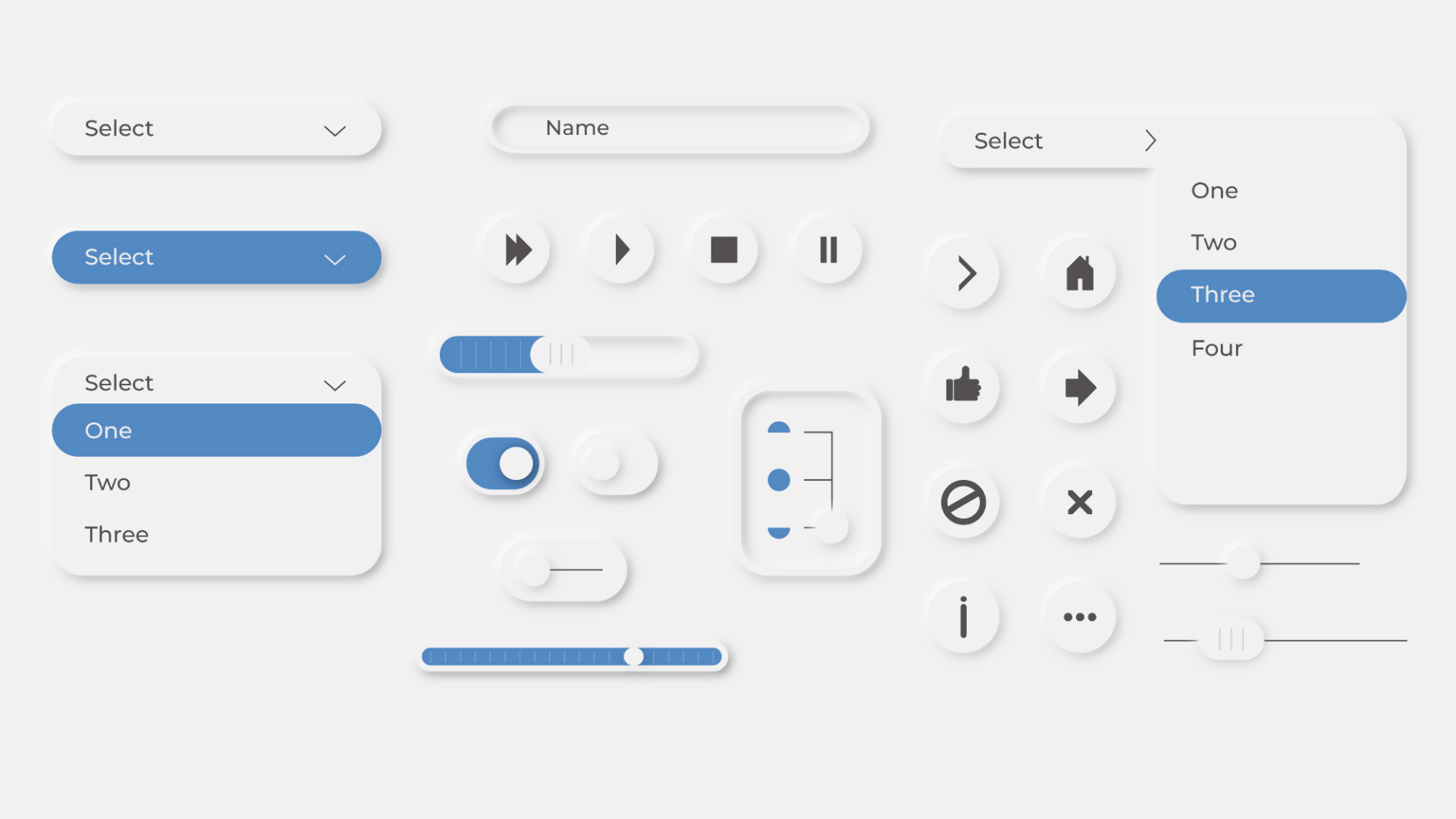
This soft, rounded, 3D-like design paved a path towards a trend that’s still in the early stages:claymorphism. This trend follows all the standards of neumorphism, but it also sets the new ones. Actually, claymorphism can easily be called a variant of neumorphism due to the similarity between these two UI designs.
Firstly, claymorphism returns to one of the primary flat design rules: the contrast between background and foreground is back in the game. Bringing the distinction between foreground and background elements also resolves accessibility issues of neomorphism. Next, we have a reliance on inner shadows to create shiny, reflective touches around elements, making them look like they are made of clay.
Image by Hype4 Academy
On the frontend side, having the claymorphic UI design doesn’t overcomplicate things unnecessarily. Instead of skeuomorphic realistic 3D elements, claymorphism free objects from traditional flat designs.
How to design your own claymorphic UI?
Let’s see how we can apply some clay to our flat-designed components. Let’s start with something simple, like a button.

This looks pretty flat, right? Firstly, let’s round it up. The border radius should be big enough to make rounded corners, but not so round it looks like a pill. The perfect border radius would be around 40% of the button height (e.g., if our button is 32px of the height, the good button radius would be 12px).

Now, let’s see how shadows create a feeling of depth! To do this, let’s add an inner shadow to our button. The shadow should be colored with a variant of the button’s background color but with higher saturation and lower brightness. Don’t forget to set the opacity of the shadow to 100% in Figma!
For our button here, we’ve set the position of the shadow to be -20% of the button’s height (e.g., 6px X and -6px Y), and we doubled the blur to 40% of the button’s height (e.g., 12px).
Again, we’ll need to add one more inner shadow for the other side of the button. Repeat the same process, but with a slightly different shade of the background color. The position of this shadow should be 20% of the button’s height, and the bur is still at 40%.
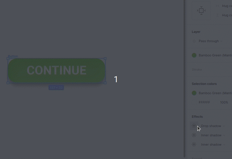
Why not add yet another shadow? This time, it will be the outer one (the drop shadow). Pick the darker shade of background color for your shadow. You can do that by color-picking the button’s darker part and adding some brightness to it. Next, set the X position of your shadow to 0 and the Y position to 40% of the button’s height (e.g., 12px).

You can always play with position and blur to get the best possible effect for your component. And…that’s it! We created a claymorphic button from the flat one!

Of course, not all page elements should follow the same rules to achieve a claymorphic look, but here is some advice on how to make your claymorphic UI as good as it can be:
- Show position: Position your inner shadows properly. Remember, these shadows suggest that there is a light source somewhere on the screen. Position them properly so your components have a proper, consistent 3D look.
- Depth: Use the Y position of the drop shadow to determine the component’s depth. Deeper components should have a bigger drop shadow, and those closest to the user should have a smaller Y position.
- Background: Soften your background. Don’t use pure white (or darker shades) as the background. Instead, use a very bright shade of the primary color.
Make your CSS go claymorphic!
Although it has more visual effects than the flat version, our claymorphic button is still easy to implement with CSS. Here is the base of our button:
.button {
appearance: none;
outline: none;
border: none;
cursor: pointer;
font-family: "Roboto";
font-style: normal;
font-weight: 700;
font-size: 16px;
line-height: 100%;
/* identical to box height, or 16px */
text-align: center;
text-transform: uppercase;
color: #ffffff;
display: flex;
flex-direction: row;
justify-content: center;
align-items: center;
padding: 8px 24px;
position: static;
width: 127px;
height: 32px;
left: 328px;
top: 32px;
transition: 0.2s ease-in-out;
background: #7dc64d;
box-shadow: 0px 4px 24px #7ee63a, inset 6px 6px 12px #73de2c,
inset -6px -6px 12px #6db33f;
border-radius: 12px;
}
It would be best to play with shadows in Figma (or you can change it in CSS) to add some aesthetic hover and active effects.

The hover state should put the element more to the foreground by decreasing the drop shadow blur and Y position:
.button:hover {
box-shadow: 0px 0px 12px #7ee63a, inset 6px 6px 12px #70cf32,
inset -6px -6px 12px #79d140;
}
The active state should give a button a deep, pressed-like color. This can be achieved by darkening the inner shadows:
.button:active {
background: #7DC64D;
box-shadow: 0px 0px 6px #7EE63A, inset 6px 6px 12px #59A229, inset -6px -6px 12px #89C760;
}
In the end, we finally have our claymorphic button ready to go. If you compare it to the typical, flat-designed button, you’ll notice that shadows are the only essential difference, and all other CSS properties are (more-or-less) the same. You can also check this example on Codepen.
Will claymorphism stay or go?
The long-lasting trends are also long-dying trends. Flat design is one of them. It’s been almost a decade since Apple’s iOS 7 came out with its variant of flat design, and we can still see the exact guidelines implemented on all-new Apple devices.
On the other hand, Google (relatively) recently presented a new version of its Material design known as Material You. This boldly tries to take the flat design for another ride over the UI. Ultimately, flat design will be here for a while since people like it. More importantly, designers are still trying to keep it fresh by constantly adding new rules.
Image from material.io
As for the claymorphism, this trend is yet to become as widespread. It’s technically a new field for most web designers, and it will inspire them to set new mainstream standards. Trends like glassmorphism, which can be seen in Microsoft’s Fluent UI, also has another revival recently due to neumorphism’s popularity. More designs will inevitably appear, and some will stay into the future.
At the end of the day, we can expect the rise of claymorphic websites, taking the Internet to a new era. Who knows? Maybe in the upcoming years, our touch screens will also be able to give us a physical depth perception of websites. This will enable users to differentiate UI components with eyes and fingers, making the fake claymorphic 3D effect more realistic. Only time will tell!