
Modern web development encompasses more than a dozen of different units of measurement. Choosing which one to use in a given situation can be confusing, especially with the introduction of responsive web design. Are you curious what each of the units really represents? Wondering how to pick the appropriate ones or what are some of the best practices while using the CSS units? Keep reading.
Making a wrong choice when using CSS units can mess up your whole web structure and make it that much harder to maintain and scale. Currently, there are 15 supported CSS units available for you to use. It's a lot, so you need to have a basic understanding of what each of them does, and how to utilize them in best way. We can separate every CSS unit on absolute and relative ones, like so:
Absolute
- Pixels (px)
- Inches (in)
- Centimeters (cm)
- Millimeters (mm)
- Points (pt)
- Picas (pc)
Relative
- Percentages (%)
- Font-sizes (em & rem)
- Character-sizes (ex & ch)
- Viewport Dimensions (vw & vh)
- Viewport Max (vmax)
- Viewport Min (vmin)
The theory of relative units
Let's start with, in today's web, more prevailing ones. In general, basis of relative unit size has to find its answer among the following:
- Relative units are based on their parent dimensions.
- Relative units are based on currently declared font-attribute
- Relative units are based on screen's viewport dimension
Since this is not a quiz question, all of the above are correct depending on what CSS unit is being used.
Listen to your parent(s) dimension
Using percentages as units, we are simply making the selected element stretch or shrink relative to his parent element. If we are to give an element a width of 100%, it would be exactly as wide as parent element he is nested in. We can break out of the parent by going above 100%. Here's a simple example below.
index.html<div class="parent">
  <div class="child"></div>
</div>
style.sass.parent {
  background: rgba(237, 109, 89, 0.75);
  height: 600px;
  width: 900px;
}
.child {
  background: rgba(134, 63, 157, 0.75);
  width: 150%;
  height: 50%;
}

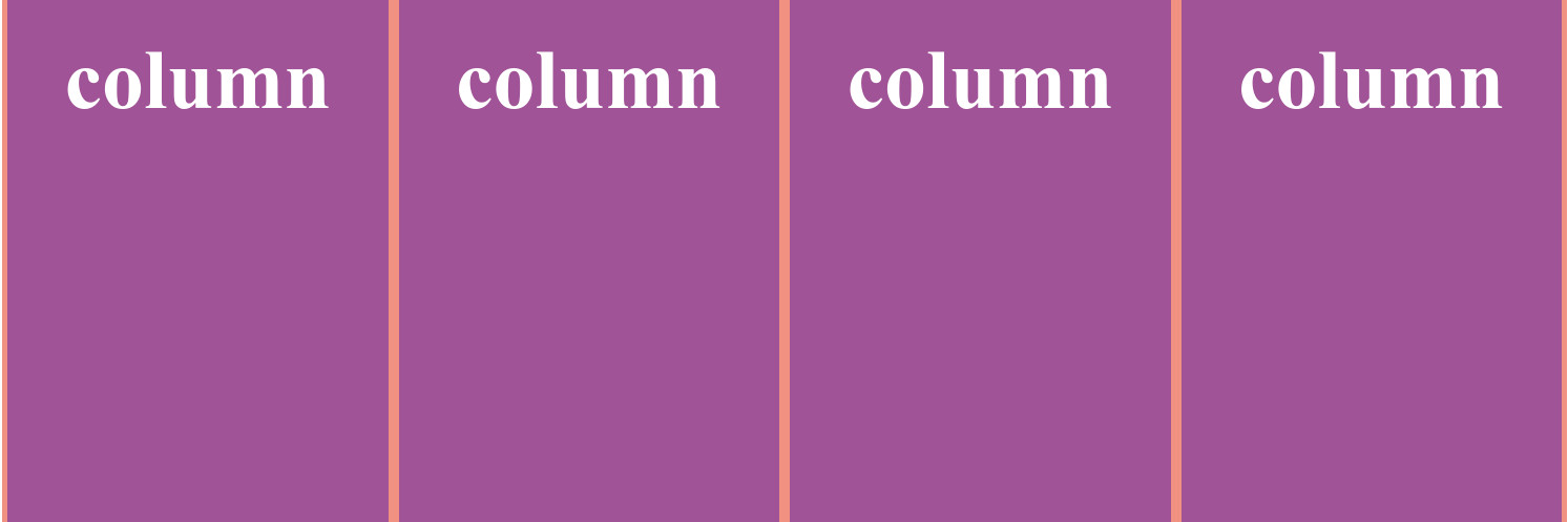
As always, there are a few exceptions to this. If we incorporate padding into the child element, it will break the math. This is due to the box model, a model that describes the content of the space taken by an element. Percentages are also often used for building the grid system for layouts.
index.sass<div class="parent">
  <div class="child">column</div>
  <div class="child">column</div>
  <div class="child">column</div>
  <div class="child">column</div>
</div>
style.sass.parent {
  background: rgba(237, 109, 89, 0.75);
  height: 500px;
  width: 100%;
}
.child {
  background: rgba(134, 63, 157, 0.75);
  width: calc(25% - 10px);
  height: 100%;
  margin: 0 5px;
  box-sizing: border-box;
  float: left;
}
Font attribute contribution
In my opinion, if you are building a website with responsive design and user experience in mind, your decisions should be rooted to the most important thing there is on any web page - text. Welcome to the world of Ems, Rems, Exs and Chs. Try to read that out loud. These are font attribute based units, which means they are tightly linked to the font size or a particular letter dimension.
Em. Probably familiar to you by now, this unit is based on the font size of its element. The name derives from the letter "M" which was commonly cast the full-width of the square block used in printing presses. It’s a somewhat widespread misconception that em units are relative to the font size of the parent element. This is due to the habit of usually not declaring font size on the said element, so the size is inherited from the parent. The kicker here is that the sizes are cascading down the DOM tree, which is why developers restrain from using it.
What this means is that if you write a code like so:
index.html<div class="example">
  <div class="em">5em
    <div class="em">5em
      <div class="em">5em
      </div>
    </div>
  </div>
</div>
style.html.example {
  padding: 50px;
  font-size: 24px;
}

.em {
  background: rgba(134, 63, 157, 0.75);
  width: 5em;
  height: 2em;
  font-size: 2em;
}
... you would get something like this:

Rem. Or simply put - root em. The only difference between rems and ems is that the rems do not cascade. This means that the basis for the rem size is only the root font size. Rems are heavily used in responsive web design, especially for grids and responsive design in general.
Ex. Value "ex" represents height of the character "x" of the font family used. This particular character is used as a ruler because it's "boxy" and has no descenders or ascenders (Typography is a beast for itself). Like ems, this is a legacy from the good ol' printing press days.
Ch. Like "ex", this guy depends on a specific character dimension, but for Ch it's the width of the zero element. It's as useless as it sounds.
Viewport is the window to the internet soul
The viewport is the user's visible area of a web page. It varies with the device, and will be smaller on a mobile phone than on a computer screen. Simple enough. Here we have Vws, Vhs, Vmins and Vmaxs, and these are your viewport dimension based units.
Vw & Vh. Viewport width and viewport height. Imagine that your browser window is sliced with a 100 by 100 grid. By giving an element width and height of 50vw and 50vh respectively, you are making that element exactly 50% of the browser window in both directions. You can do some funky things switching the units and then manually resizing the window!
Vmin & Vmax. A weird one, and not particularly useful. This unit uses the browsers viewport dimension that is at any given time the larger or smaller in size. So for example, if you display it on a landscape screen, the vmax value would be the percentage of the width of the viewport.
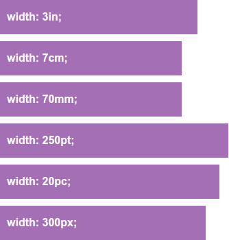
Absolute units corrupt absolutely
Maybe not that dramatic, but you're not going to have a good time using them in today's web development. We are talking about self regulating, real world dimensions. They are great for printing, but most of them is not as useful anymore (pixels aside). Let's get to know them anyways.
In, Cm, Mm. Inches, centimeters, and millimeters. Not much else to say here. They represent a real physical measure.
Pt. Or points, it's a typographic term. You've met with this fellow in MS Word or LibreOffice. It is also a physical measure, and it measures exactly 1/72 of an inch.
Pc. Or picas. Another typographic term, represents 12 points, or 6th of an inch. This unit might be used for a printed stylesheet.
Px. Device pixel. Whole world wide web works in pixels. Everything renders in pixels. Javascript dreams in pixels. Let's talk some more about pixels.
Protip. There's a handy tool for mixing all sort of units - calc(), but this is still an experimental technology. Be sure to check where can you use it.
What's the deal with a pixel?
There is actually a lot to be said about the smallest unit of your screen, but we'll stick to what's relevant to you, web developer. A long time ago, on computer screens far far back (pardon my references, just got back from the premiere), one could clearly see what a pixel was. The definition goes like this - pixel, one of the many tiny dots that make up the representation of a picture in a computer's memory. Later on, screen resolutions got so high we don't even think in terms of pixels. Can you spot the difference?

But then - smartphones arrived. Holding a tiny screen few inches from our faces, pixels revealed themselves once more. Photos were not as clear, the text was not as smooth. Resolution needed to get even higher, and pixels shrunk. This was a problem for the web who always considered pixel a definite unit, all of the layouts were built "pixel perfect", and would collapse on even a slight change in width or height. Web pages on mobile phones looked perfect, but viewed as under a microscope. So, coupled with the idea of responsive design, the W3C came up with the reference pixel. Forget about the now arbitrary definition of pixel, for CSS pixel is not necessarily exactly the same size as a single pixel on your screen. Mind blown? Here's the definition in the specs:
If the pixel density of the output device is very different from that of a typical computer display, the user agent should rescale pixel values. It is recommended that the reference pixel be the visual angle of one pixel on a device with a pixel density of 96dpi and a distance from the reader of an arm's length.
If you feel like getting more into it, you can check out some great literature on it.
How do I use this knowledge in web development?
What is the "proper" way to do text sizing in CSS? Percentages? Pixels? Rems? The answer depends entirely on the element being sized, the text it contains, and its relationship to the page. In short, it depends on the design.
For example, things measured in characters should be large blocks of text, since the human eye finds them easier to read when they are 60 characters wide. Also, first character indentation should be considered in terms of ems or rems since font size will probably change depending on the device.
Protip. Use rem sized breakpoints! This way they scale and fire at appropriate times when user uses zoom in or out browser functionality.
Me personally? I slap on a pixel base font size at the root level, and then use rem values for modules and em values for text elements. Pixels for everything else. The reason for using ems for text elements is so they can cascade relative to the module. Yes, it's tricky when not careful, but sweet when done properly. You can use base font size and rems throughout the website, and you'll do just fine. There's a wonderful Codepen example of this model made by Chris Coyier.
Now that you are aware of different sizing options and where to use each of them, your next project can be much more flexible and modular. Always have in mind the scope of possible devices on which your website should render and how that relates to units being used in different sections of your CSS architecture. There is no "best" solution, so always experiment and find something that suits you best!